
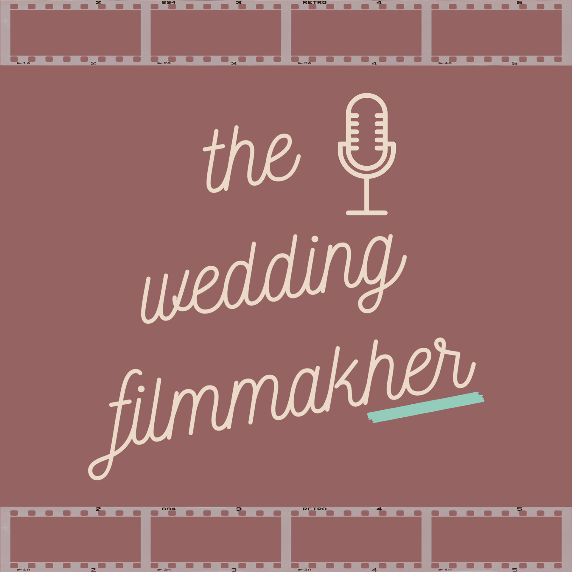
This was the initial logo concept created for The Wedding Filmmakher podcast. The client expressed a strong connection to the mauve color palette and the vintage-style microphone, both of which became key elements in the final design. While the overall branding evolved during the process, these details remained consistent — a testament to the importance of building a brand identity that feels authentic from the start.
Read her full review to see how the final result brought her vision to life.
__________________________________________________________________
This was the first logo concept created at the start of the branding process. From the beginning, the client knew she wanted something with a vintage, film-inspired personality. She was especially drawn to the soft mauve color, the hand-drawn microphone, and the playful script style — all of which helped convey the creative and personal nature of her podcast.
As we moved forward, I kept the mauve tone as a consistent part of the visual identity. The microphone remained a central icon, tying into the podcast’s format and reinforcing brand recognition.
__________________________________________________________________

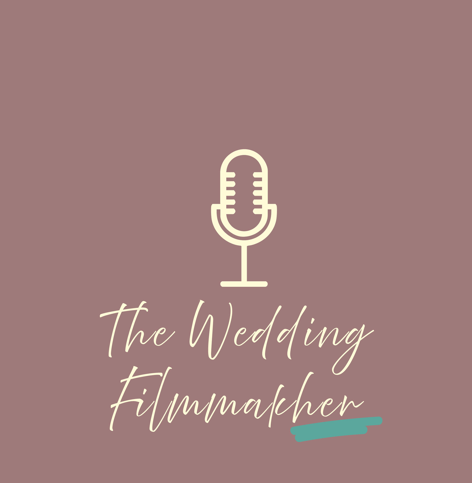
This horizontal variation serves as the secondary logo in the full brand suite. Designed for flexibility, it’s ideal for applications like podcast covers, website headers, email signatures, and social media graphics where a wider layout works best.
It maintains the key visual elements from the primary logo — the vintage microphone icon, the handwritten script, and the soft mauve color palette — ensuring brand consistency across all platforms. The placement of the microphone alongside the typography creates a balanced, streamlined look while still feeling personal and creative.
This logo allows the brand to adapt across different formats without losing its identity, offering versatility while staying aligned with the client’s original vision.
__________________________________________________________________
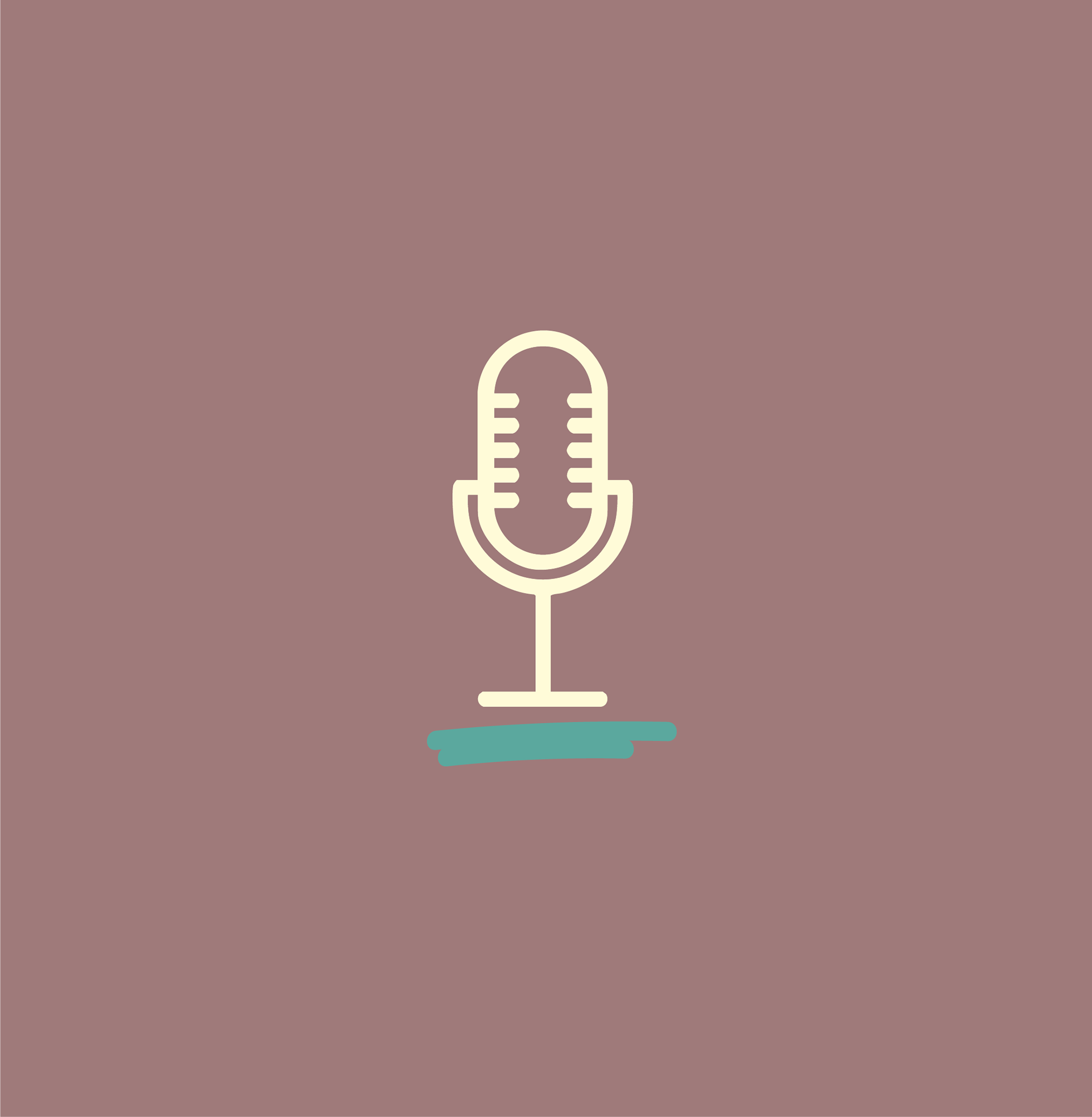
This submark logo was designed as a simplified visual signature for the brand—perfect for social media icons, merchandise, or watermarking. The clean microphone illustration and subtle brush of color capture the creative energy of the podcasting world while keeping the mark modern and versatile. It’s a compact emblem that pairs seamlessly with the full logo, ensuring the brand stays recognizable wherever it's seen.
__________________________________________________________________
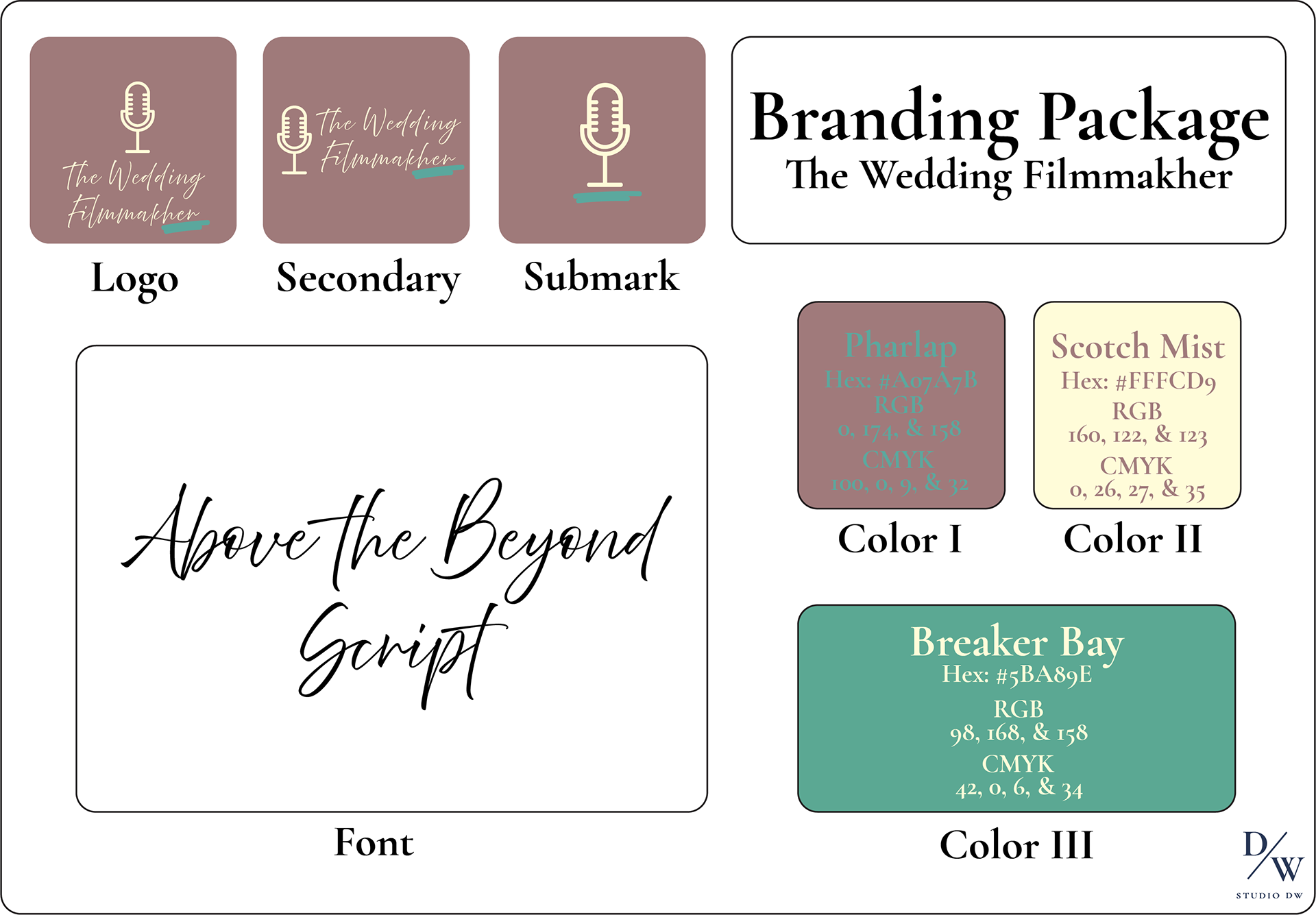
This branding package was designed to reflect the elegant and cinematic aesthetic behind The Wedding Filmmakher. With a clean, easy-to-follow layout, it includes logo variations, a versatile submark, and a refined color palette featuring soft tones like Breaker Bay and Scotch Mist. Paired with a classic typeface Above the Beyond, the guide ensures every touchpoint—whether digital or print—feels cohesive and thoughtfully styled. It’s a streamlined toolkit built to support consistent, high-end visuals from start to finish.
__________________________________________________________________