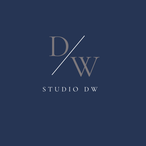
This was the Original Logo for Studio DW. I felt as though it was too simple and it definitely didn't scale well. I was originally happy with this and then later on realized I wasn't. In the coming few pictures you'll see why I love what I created.
__________________________________________________________________

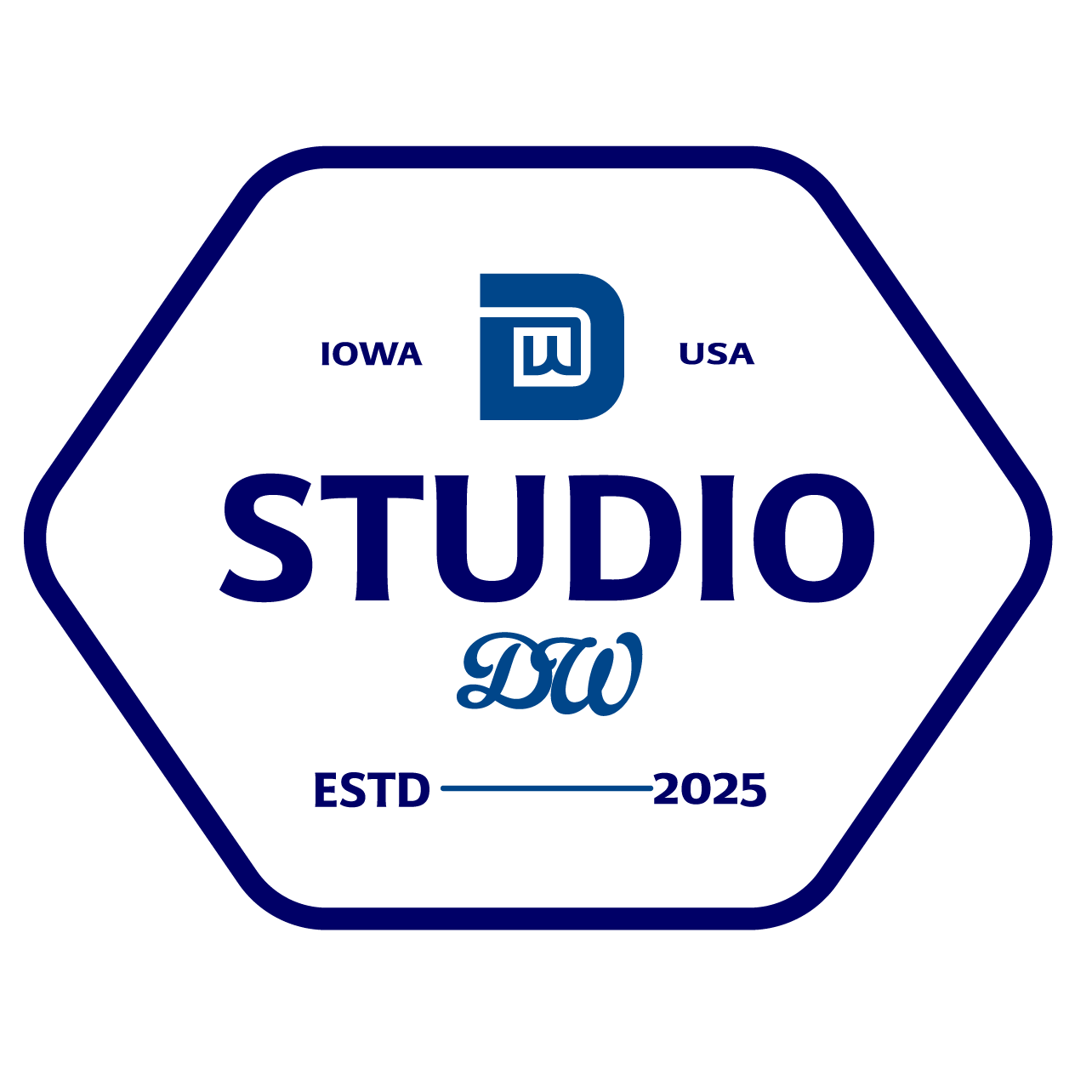
This is the New Logo that I designed for Studio DW! It follows so many more design rules such as symmetry and keeping things equal. It uses negative space in the top "D" to fit the "W" inside of it. It also includes the state I am located and the country I live in! I added the year we were established because it added that previously mentioned symmetry but also because it is important to remember when you started! I was going to use Roman Numerals but later decided on this instead.
__________________________________________________________________