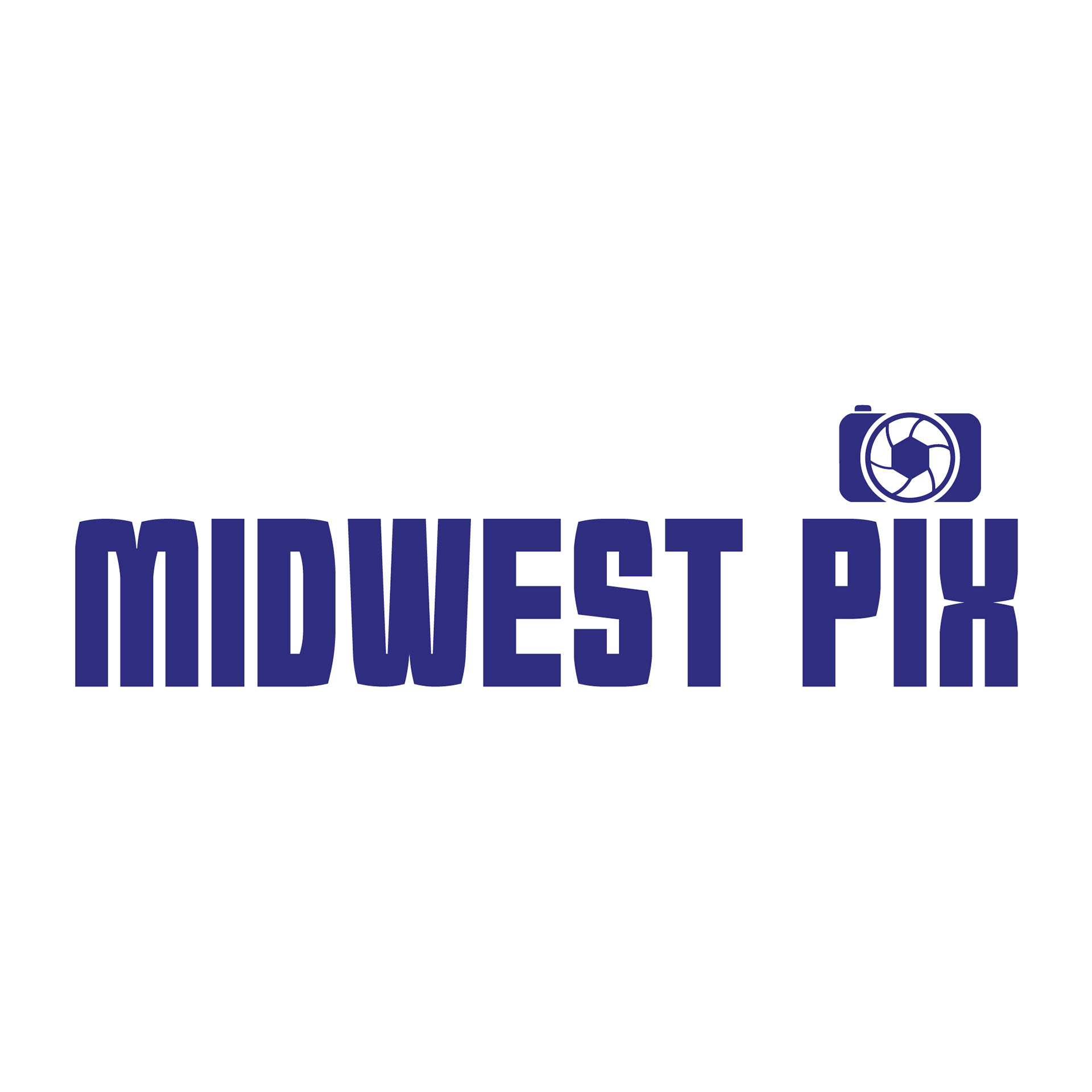
This was the original logo for Matt Purtill’s company, Midwest Pix. Having been in contact with Matt for years, I reached out to showcase my ability to create a fresh, new design. It appears my timing was impeccable! Don’t just take my word for it—see what Matt had to say in his review.
__________________________________________________________________
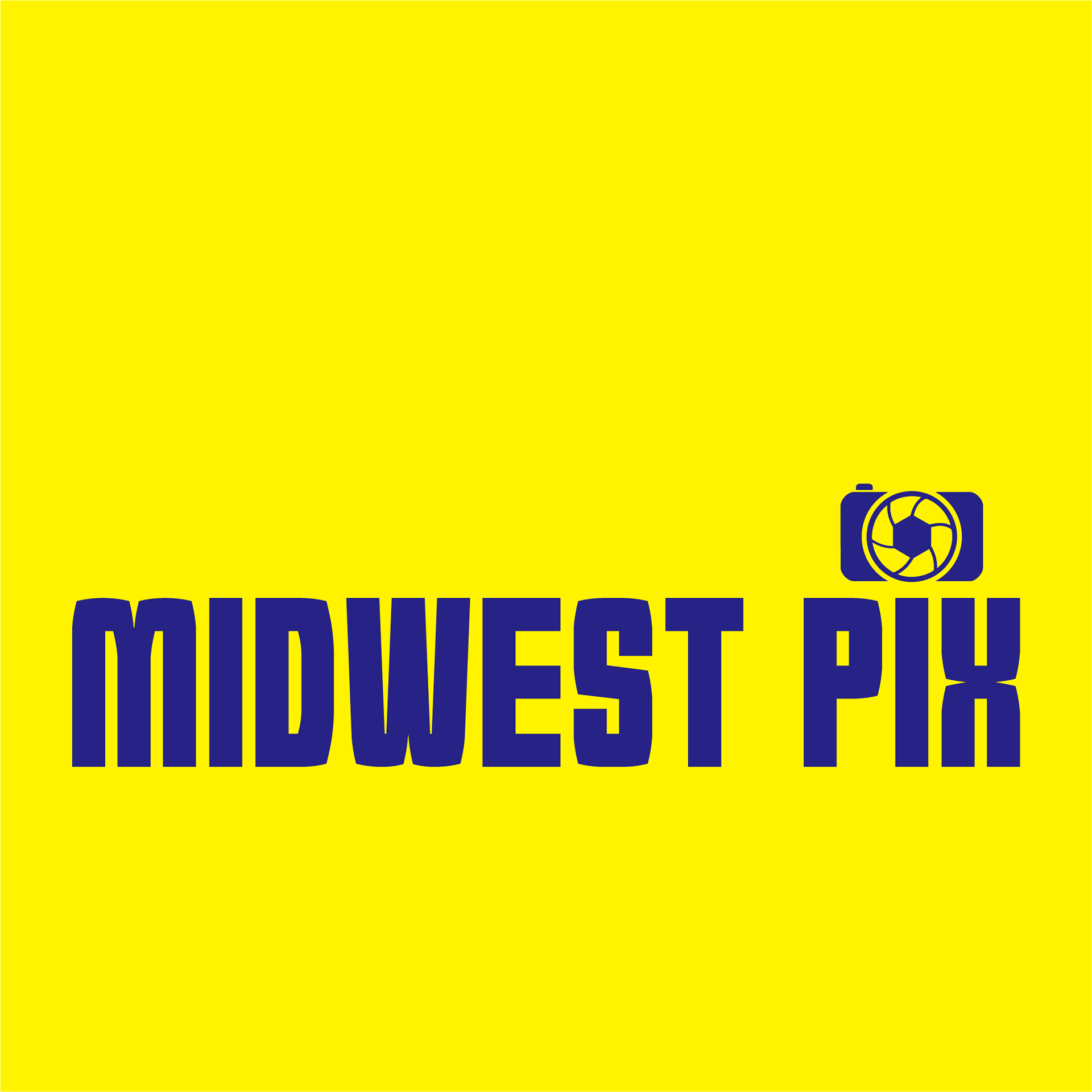
This concept was born from Matt’s desire to retain his signature yellow and blue—colors he believed would command attention in any crowd. I assured him, “I will make that work,” and true to my word, I crafted a design that truly stands out. To honor his original identity, I thoughtfully incorporated the shutter element by blending a camera motif with that effect, ensuring the logo remained distinctly his own.
__________________________________________________________________
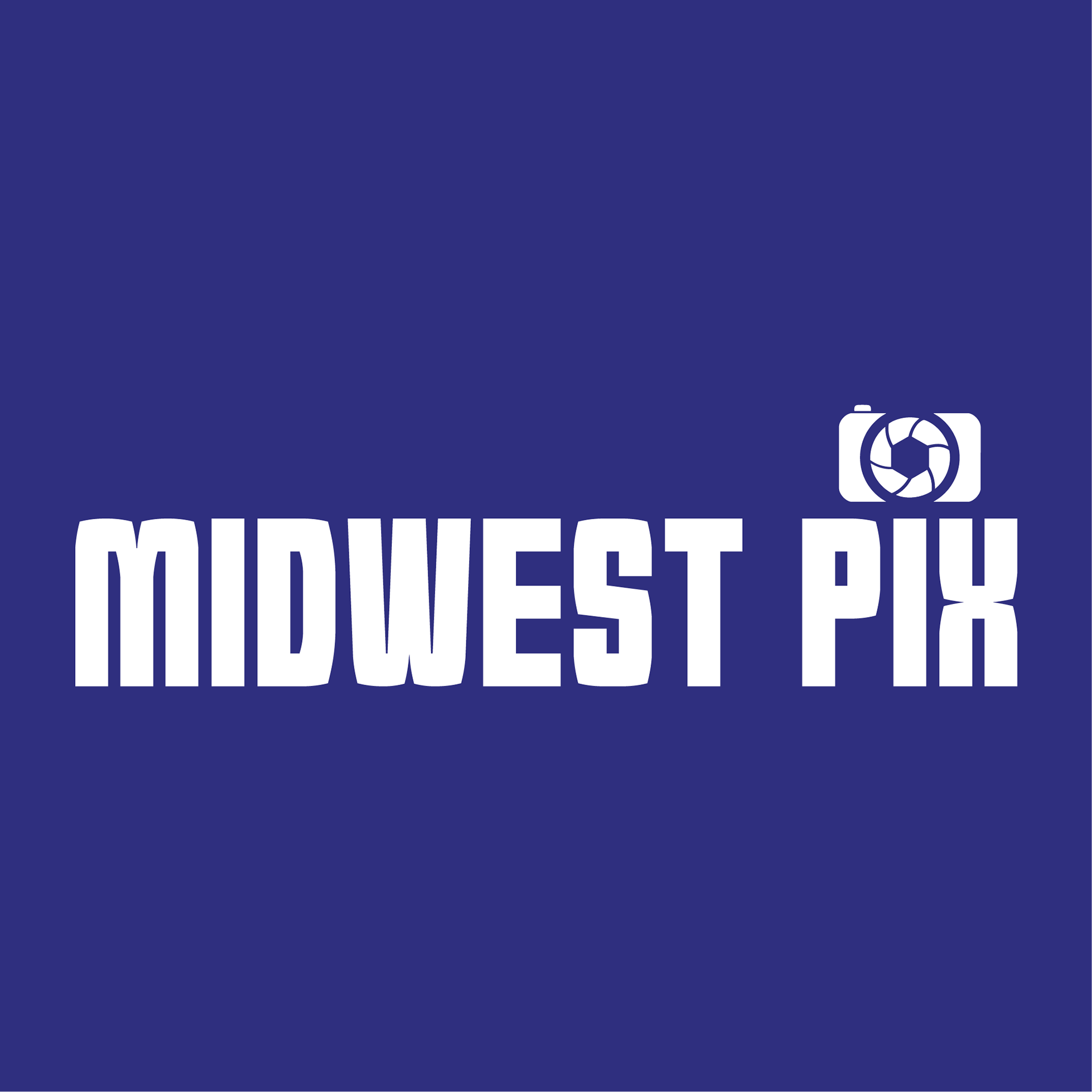
The blue and white versions of the Midwest Pix logo were developed to offer a more refined and versatile look, suitable for a wide range of applications. The deep blue background conveys professionalism and reliability, while the crisp white text and camera icon ensure maximum legibility and visual impact. This colorway maintains the brand’s bold identity while providing a sleek, modern option that works seamlessly across digital and print media. By adapting the original design to these colors, I ensured the logo remains instantly recognizable and effective, no matter the context.
__________________________________________________________________
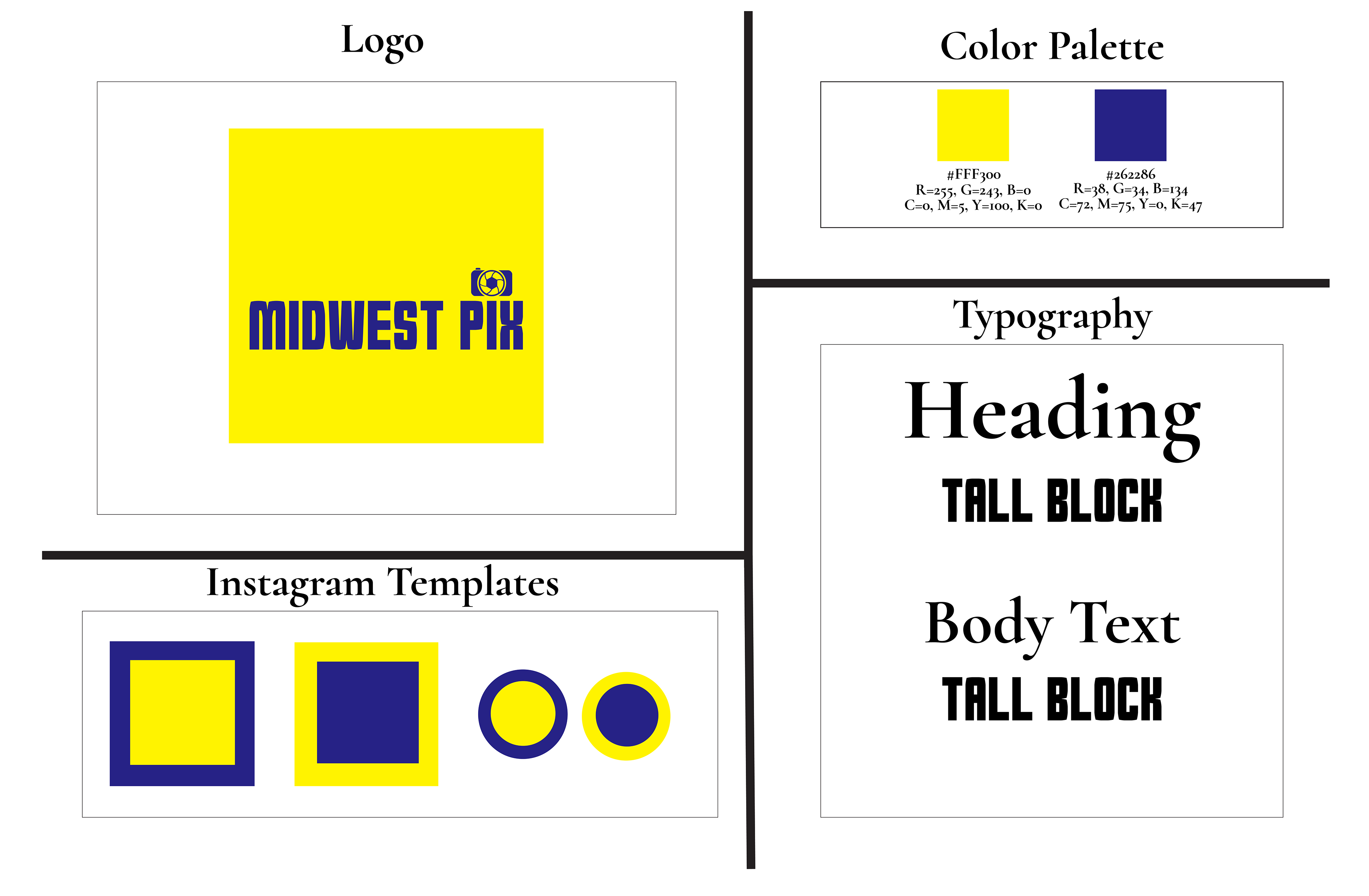
Think of this guide as your creative sidekick—it keeps everything from logos to colors and fonts consistent without slowing you down. It’s clean, simple to use, and packed with everything you need to keep the Midwest Pix vibe strong across the board. Whether you're designing a post or planning a campaign, this guide makes it easy to keep things looking sharp and on-brand.
__________________________________________________________________