
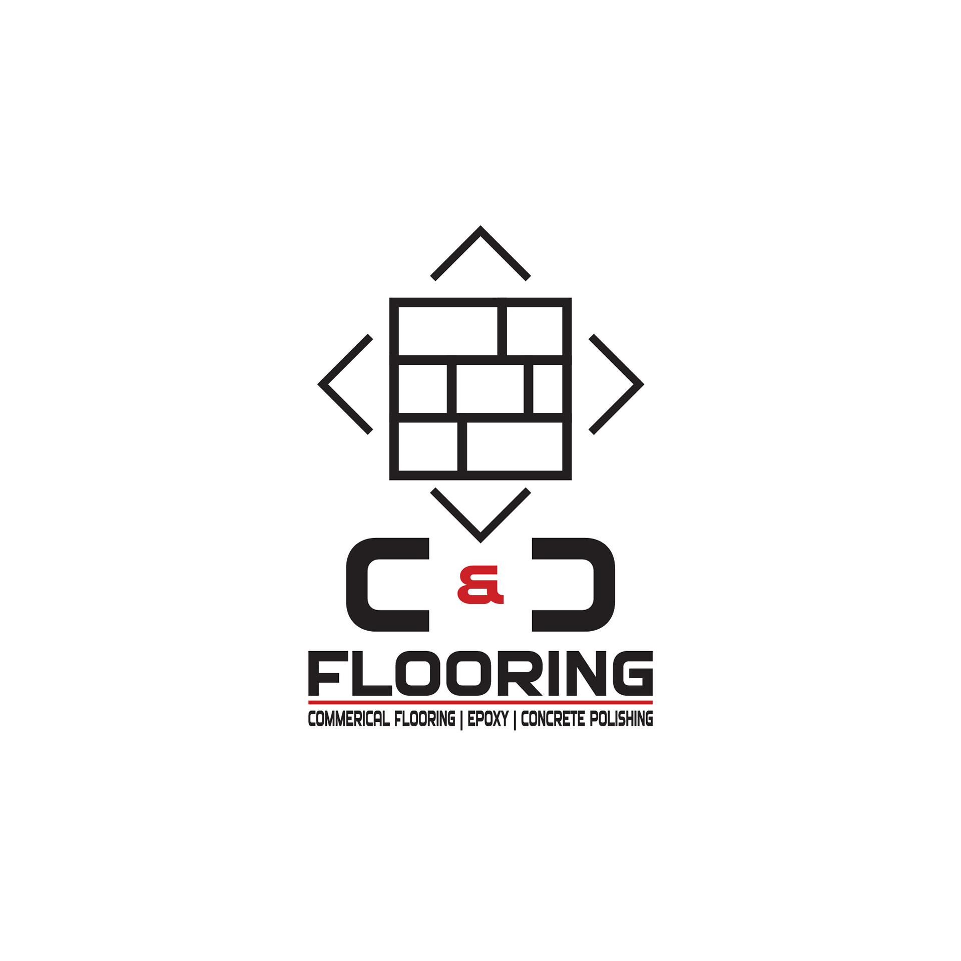
I created this logo for Dawson Gifford and his dad for their company. The main C & C Flooring logo was designed to fully represent the brand — strength, structure, and precision. I started with the idea of capturing what flooring visually looks like, so I incorporated a tile-inspired grid centered above the text. The geometric layout represents craftsmanship and attention to detail, while the four surrounding angle lines point inward, symbolizing direction and focus on quality.
Below, the bold “C & C” lettering creates a strong foundation, balanced by the red ampersand to add energy and a modern contrast. The word FLOORING anchors the design, supported by the tagline underneath to clearly define the company’s core services: Commercial Flooring, Epoxy, and Concrete Polishing.
This logo was created to be the face of the brand — professional, balanced, and built to communicate what the company stands for at a glance.
__________________________________________________________________
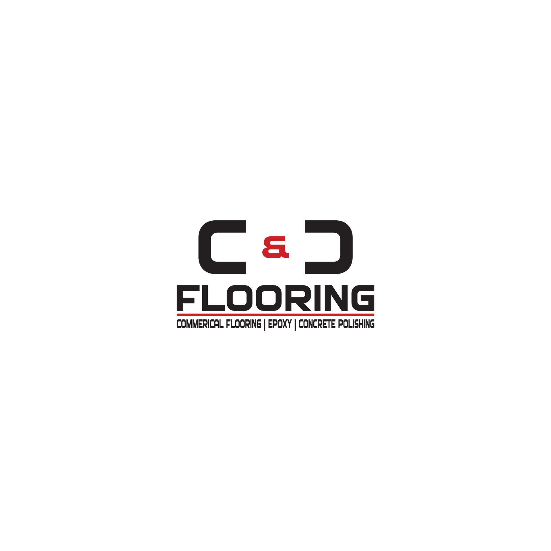
The submark simplifies the full logo into a clean, text-only version that focuses on the name itself. Removing the tile grid allows the “C & C Flooring” typography to stand out on its own while maintaining the same strong visual identity.
This version works perfectly in tighter spaces or for applications where the full design might be too detailed — like letterheads, business cards, website headers, or truck decals. It’s bold, readable, and still instantly recognizable as part of the C & C brand.
This version works perfectly in tighter spaces or for applications where the full design might be too detailed — like letterheads, business cards, website headers, or truck decals. It’s bold, readable, and still instantly recognizable as part of the C & C brand.
__________________________________________________________________
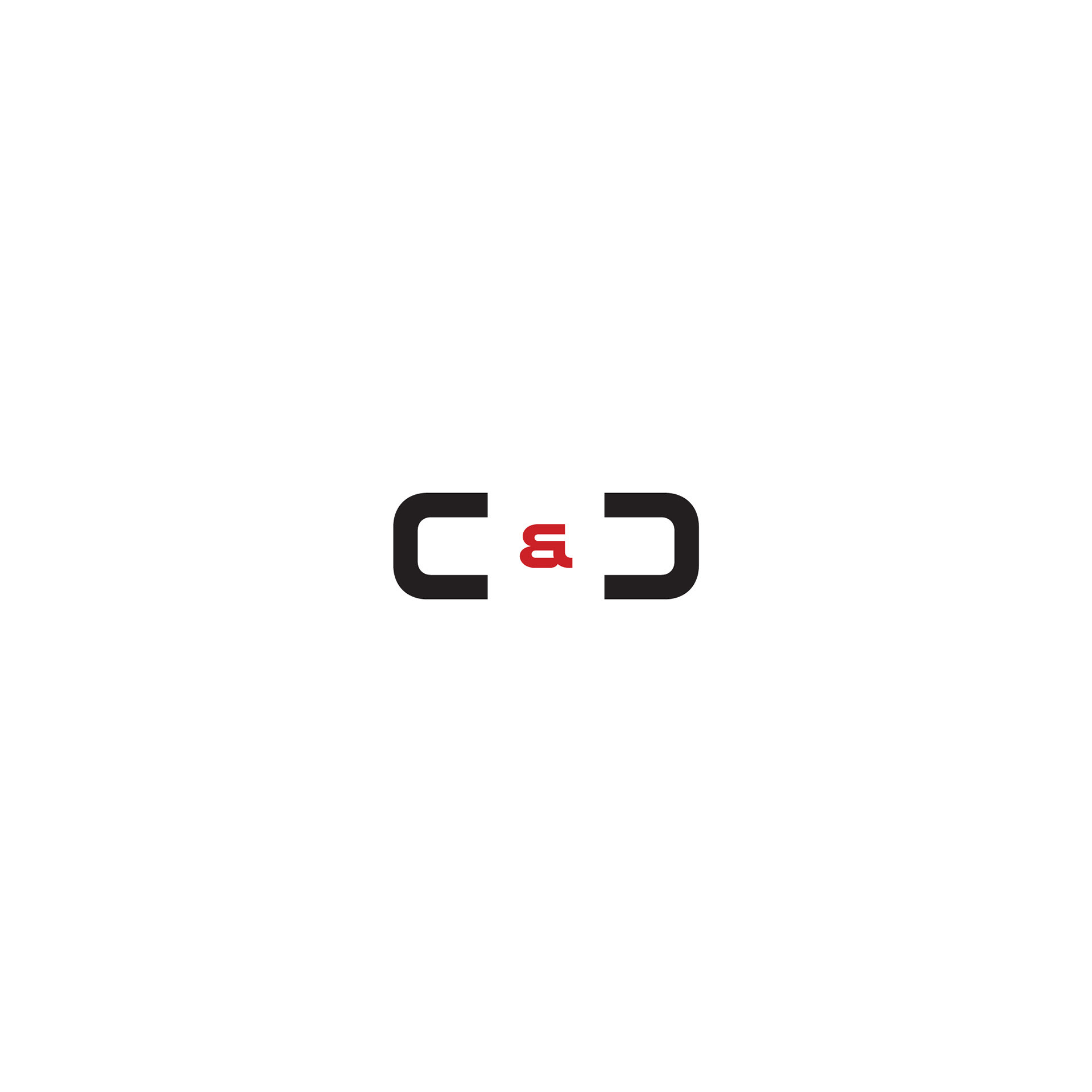
The icon mark is the most minimal and versatile version of the brand. It focuses solely on the “C & C” — the heart of the name — with the red ampersand adding a punch of contrast and personality.
This simple version was designed for small-scale or digital use, such as social media profile images, website favicons, or branded gear. Even without the extra elements, the icon keeps the same balance and confidence found in the main logo, making it a clean and memorable visual stamp for the brand.
This simple version was designed for small-scale or digital use, such as social media profile images, website favicons, or branded gear. Even without the extra elements, the icon keeps the same balance and confidence found in the main logo, making it a clean and memorable visual stamp for the brand.
__________________________________________________________________
Each version of the C & C Flooring logo plays a specific role — built to keep the brand consistent, adaptable, and professional across every platform and use.
__________________________________________________________________