
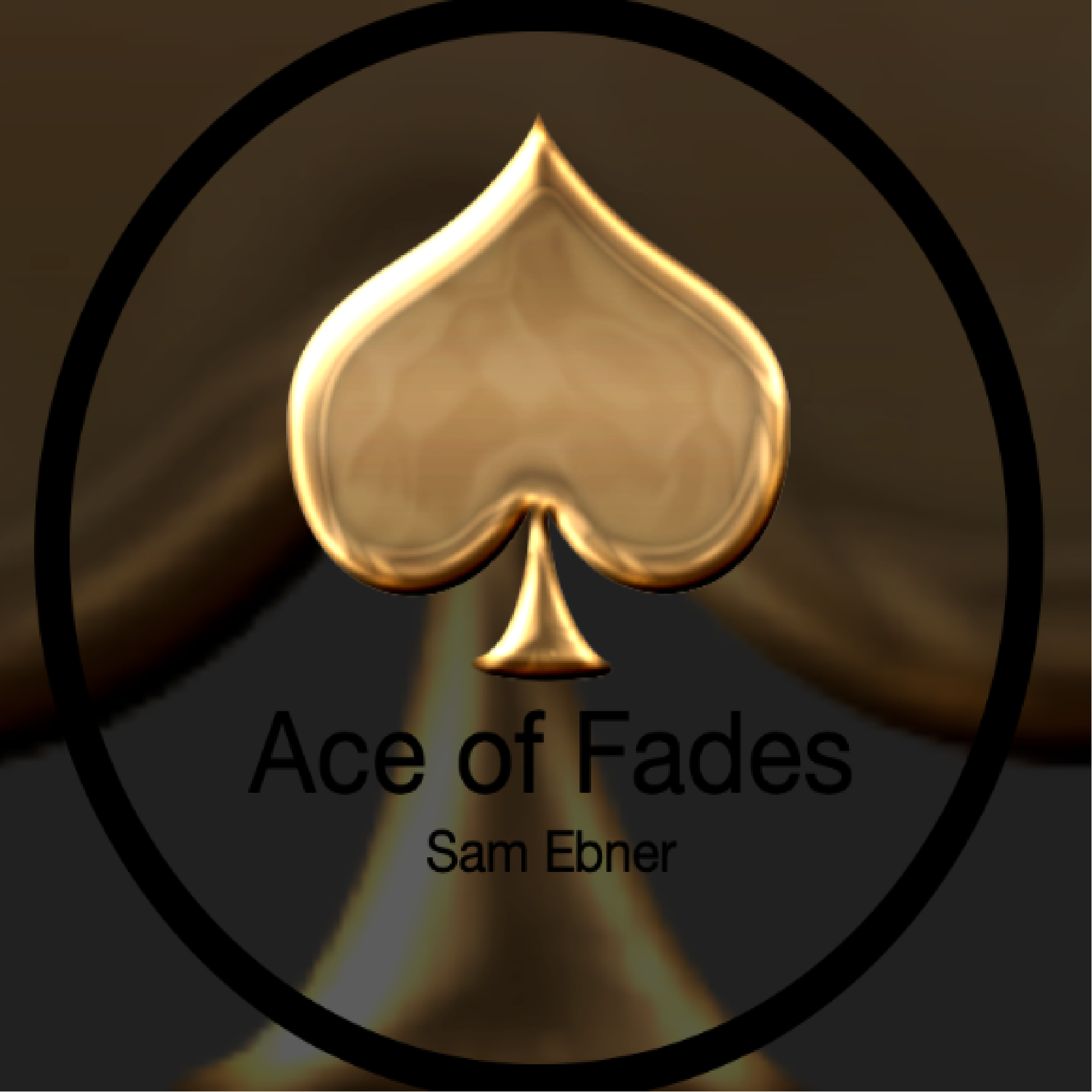
This was the existing logo Sam Ebner was using for Ace of Fades before we began working together. I reached out at just the right moment—she was preparing to relocate her business, which made it an ideal time to refresh and evolve the brand. The collaboration that followed led to a refined identity that aligned perfectly with her vision. You can hear more about the experience in her review.
__________________________________________________________________

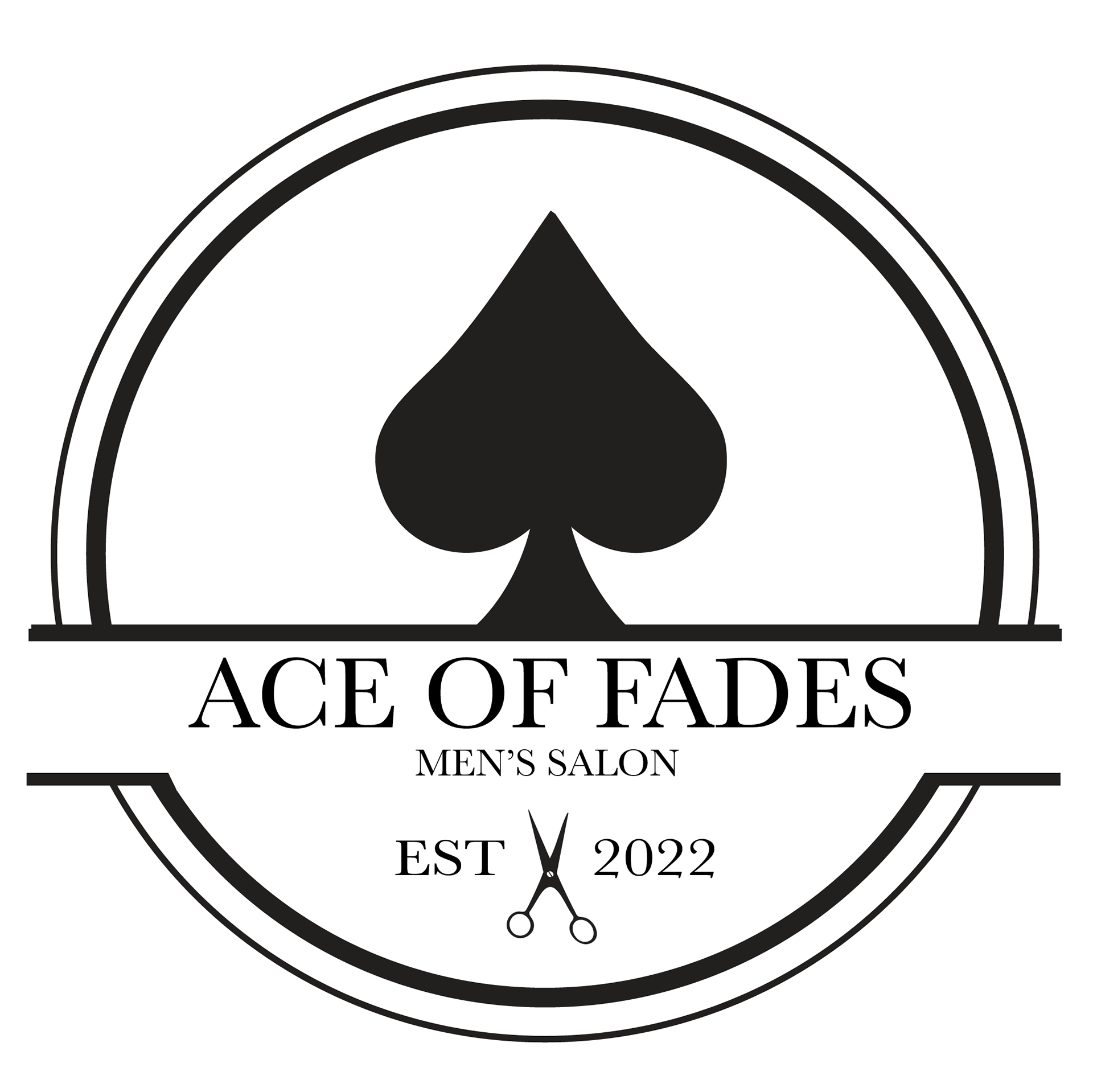
This is the finalized logo for Ace of Fades—a clean, confident design that captures the sharp, professional vibe of the brand. The spade icon paired with classic typography and subtle detailing like the scissors and “EST 2022” mark a polished evolution from the original concept. This logo reflects the culmination of Sam’s vision and our collaborative rebranding process, bringing the identity full circle with a bold and timeless finish.
__________________________________________________________________
This is the white variant of the final Ace of Fades logo—featuring the same confident, polished design adapted for use on darker backgrounds. The iconic spade, clean typography, and subtle detailing remain, but the all-white treatment adds a sleek, high-contrast feel that broadens the brand’s versatility. It’s a simple shift that ensures the identity stays bold and cohesive across any setting.
__________________________________________________________________
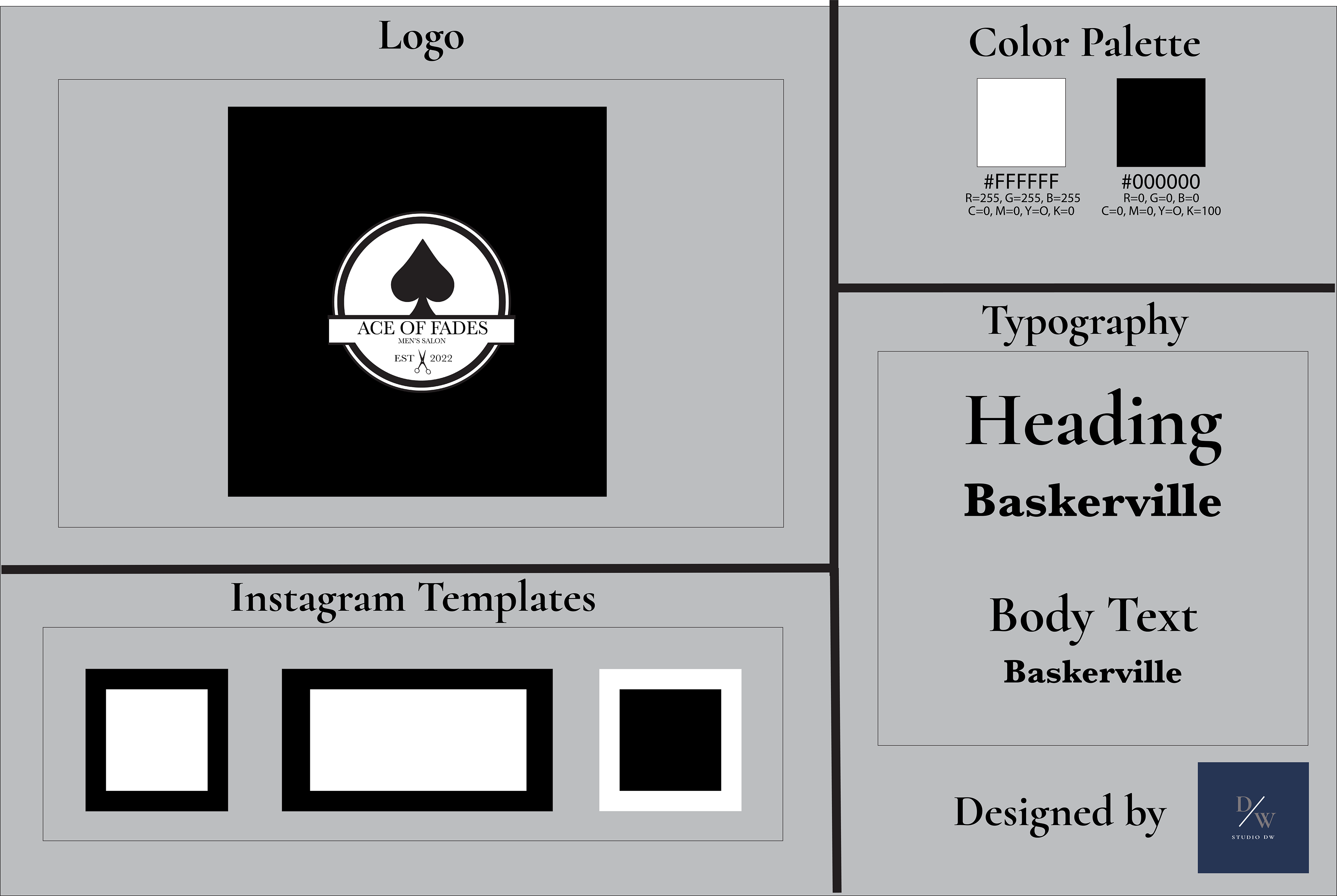
This brand style guide captures the crisp, elevated aesthetic behind Ace of Fades. With a bold black-and-white color palette, refined Baskerville type, and sharp logo detailing—like the spade and subtle barber scissors—it all comes together to express precision, tradition, and professionalism. The Instagram templates round things out with clean layouts built for consistency and visual impact. This guide is designed to keep the brand looking polished across every platform and touchpoint.
__________________________________________________________________